It’s no secret that the world is changing.
Construction costs are rising, the number of empty sites in urban centers is diminishing, and the world is demanding more of its built environment. It’s no longer enough for a store to exist near a customer base, it has to provide an experience. Multifamily developments can’t get by on location alone – they are expected to provide compelling and sophisticated amenities. Even healthcare is seeing significant disruption in how it’s delivered to communities.
With this rapid change comes a need to think creatively and strategically about our clients’ assets. The landscape of ownership and development is full of opportunities to take something that’s already there and do something interesting with it. From a strategic business imperative comes a need to shift our design perspective. As a pioneer in mixed-use environments, OKW has been thinking like this for decades. Our ability to reimagine, reinvent, or reposition existing spaces is what has made us a long-term partner in both design and business strategy.
Katie Lambert, design rockstar and OKW partner
Katie Lambert, AIA is instrumental in that partnership. In her role as OKW’s Design Director, she uses her eye for holistic and thoughtful design in nearly everything that we create. As a panelist in the upcoming Bisnow Chicago Adaptive Reuse and Repositioning, she will speak about the importance of creative thinking in addressing the constraints that architects face when transforming existing spaces.
We have divided this creative, architectural approach into three categories: reimagine, reinvent, and reposition.
EXISTING CONDITIONS
From afterthought to centerpiece.
Today, we are talking about a recent project in suburban Chicago that embodies reimagining a space: a design job where we created a wondrous new space while keeping its original use intact.
We were asked to look at the office component of a large bottling and distribution facility. The office itself was a dated appendage of the larger industrial space, with a distinct and specific use but lacking in thoughtful design. A new generation of ownership, one that understood the value of good design, had taken the helm and emphasized their desire for an office that not only worked for their people, but acted as a beacon that positively communicated their brand.
Photograph by Nick Ulivieri
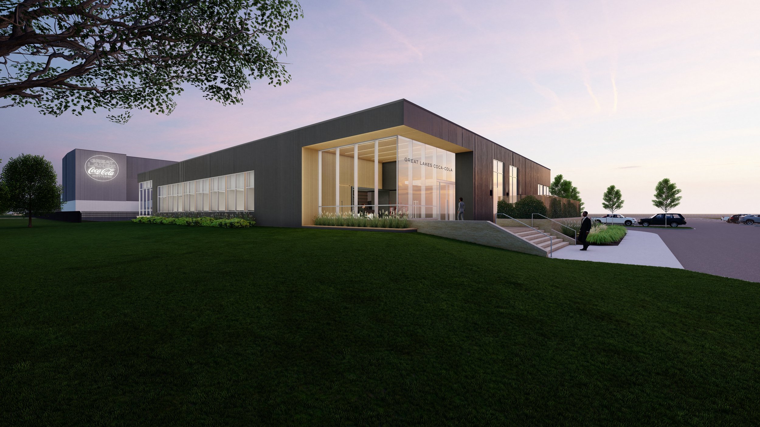
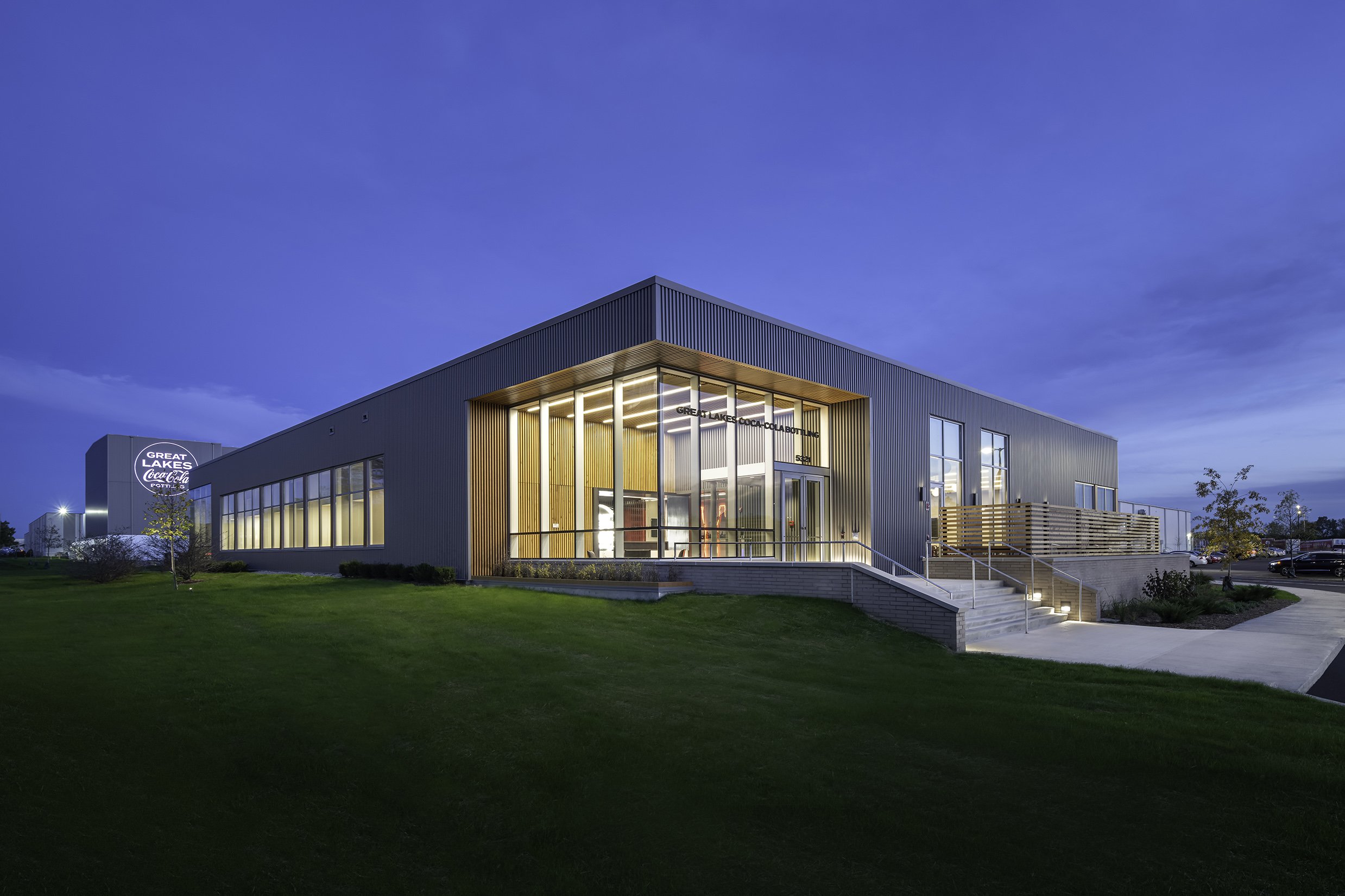
Originally, unless you were familiar with the building, you couldn’t be completely sure where the entry was. The original office was too opaque to give anyone a sense of where to go, let alone who you were about to meet. Reimagined, the new lobby and office are transparent and full of branded moments.
Photograph by Nick Ulivieri
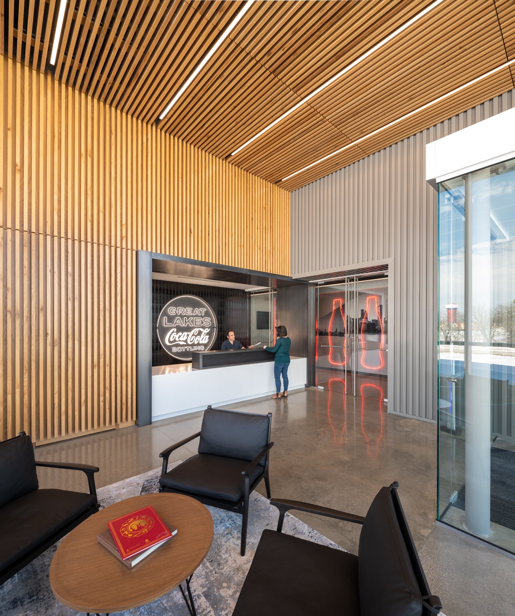
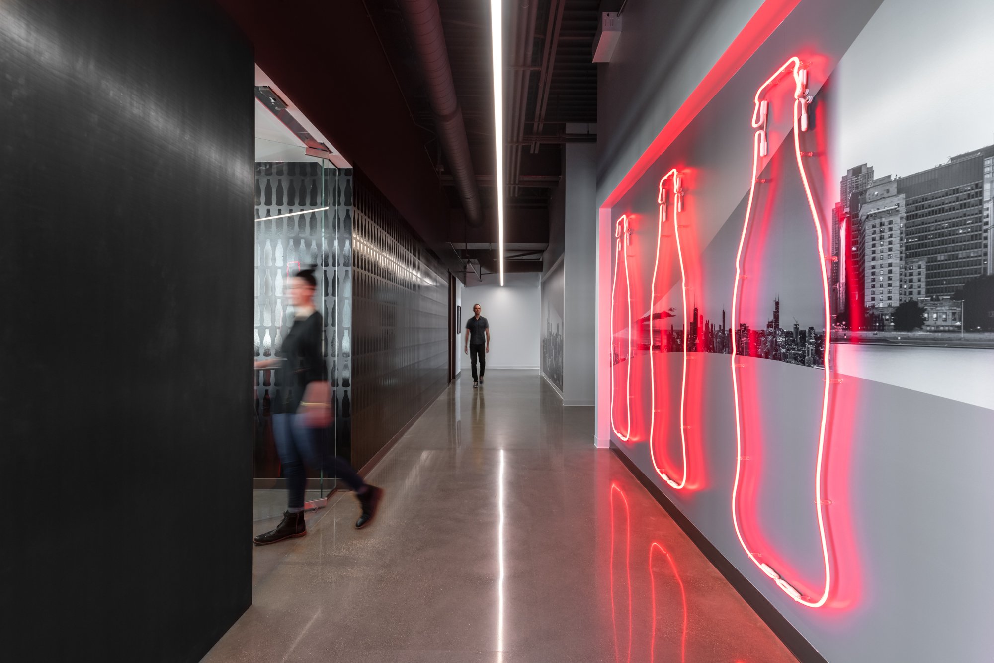
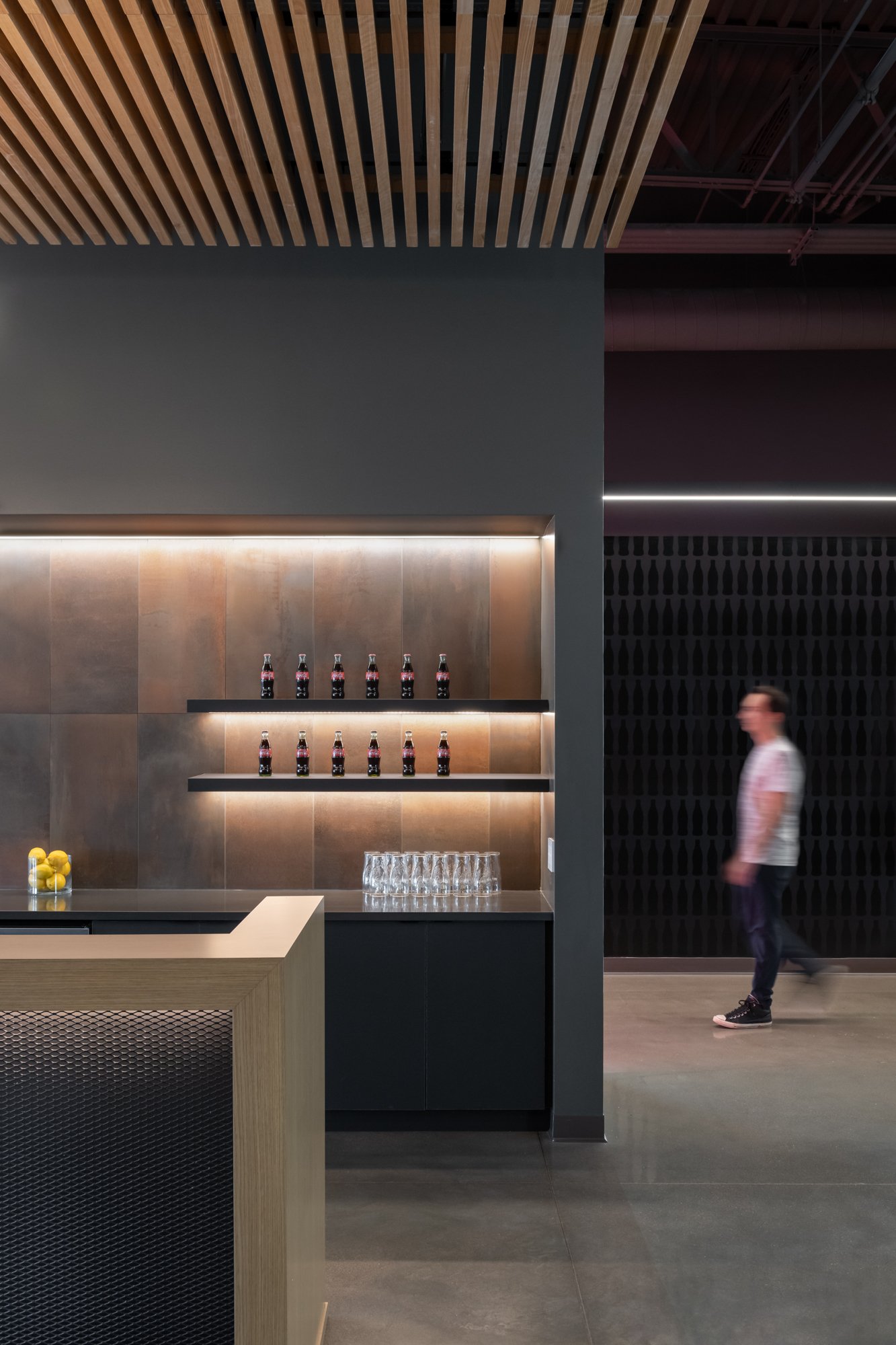
Today, when you drive up to the building, you can’t miss the lobby. It glows from within thanks to the glass that makes up the vast majority of the exterior wall. Wood lines the walls and ceilings, creating an elegant enclosure over the reception and waiting area with lounge seating. From there, the pathway to the open office, bar, and training room is dotted with graphic installations of Chicago and our client’s biggest account (Coca-Cola).
The office is still an office – but reimagined as an inviting, warm, and engaging space. No longer a stale and dated area, it is used by office workers and truckers alike.
Photography by Nick Ulivieri


