It’s no secret that the world is changing.
Construction costs are rising, the number of empty sites in urban centers is diminishing, and the world is demanding more of its built environment. It’s no longer enough for a store to exist near a customer base, it has to provide an experience. Multifamily developments can’t get by on location alone – they are expected to provide compelling and sophisticated amenities. Even healthcare is seeing significant disruption in how it’s delivered to communities.
With this rapid change comes a need to think creatively and strategically about our clients’ assets. The landscape of ownership and development is full of opportunities to take something that’s already there and do something interesting with it. From a strategic business imperative comes a need to shift our design perspective. As a pioneer in mixed-use environments, OKW has been thinking like this for decades. Our ability to reimagine, reinvent, or reposition existing spaces is what has made us a long-term partner in both design and business strategy.
Katie Lambert, design rockstar and OKW partner
Katie Lambert, AIA is instrumental in that partnership. In her role as OKW’s Design Director, she uses her eye for holistic and thoughtful design in nearly everything that we create. As a panelist in the upcoming Bisnow Chicago Adaptive Reuse and Repositioning, she will speak about the importance of creative thinking in addressing the constraints that architects face when transforming existing spaces.
We have divided this creative, architectural approach into three categories: reimagine, reinvent, and reposition.
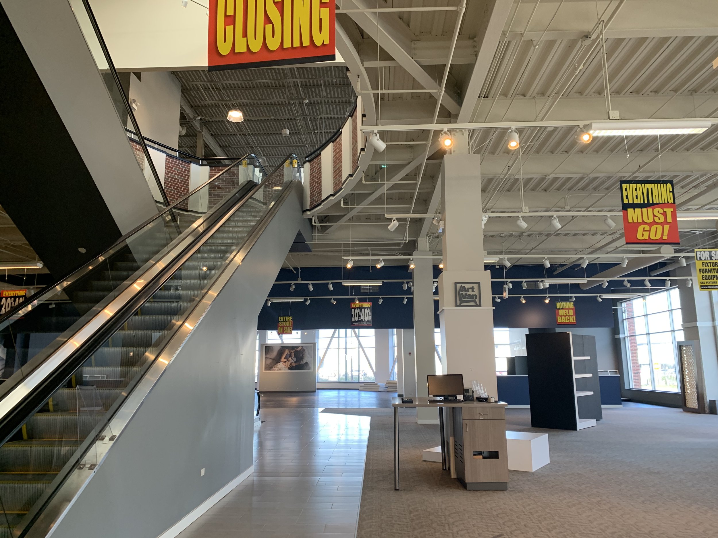
EXISTING CONDITIONS
Art Van Furniture out, Beer Distributor in.
Today we are writing about reinventing a building - keeping it intact while completely changing its intended use. This happens all the time in our studio: Goddess and the Baker used to be a bank, Fred’s Garage started as a gas station, and the building that houses TimeOut Market began in the late 19th century as a meatpacking warehouse.
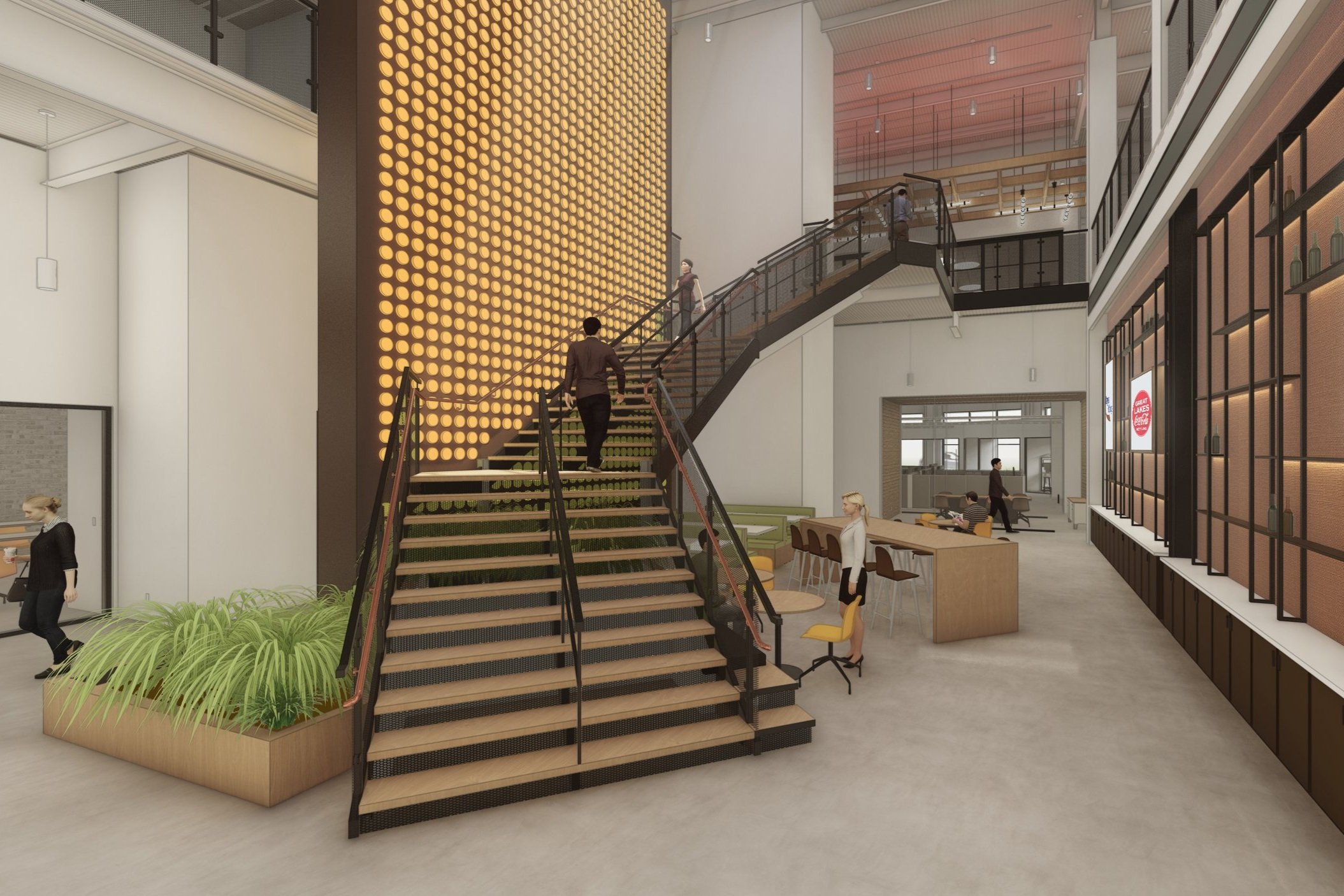
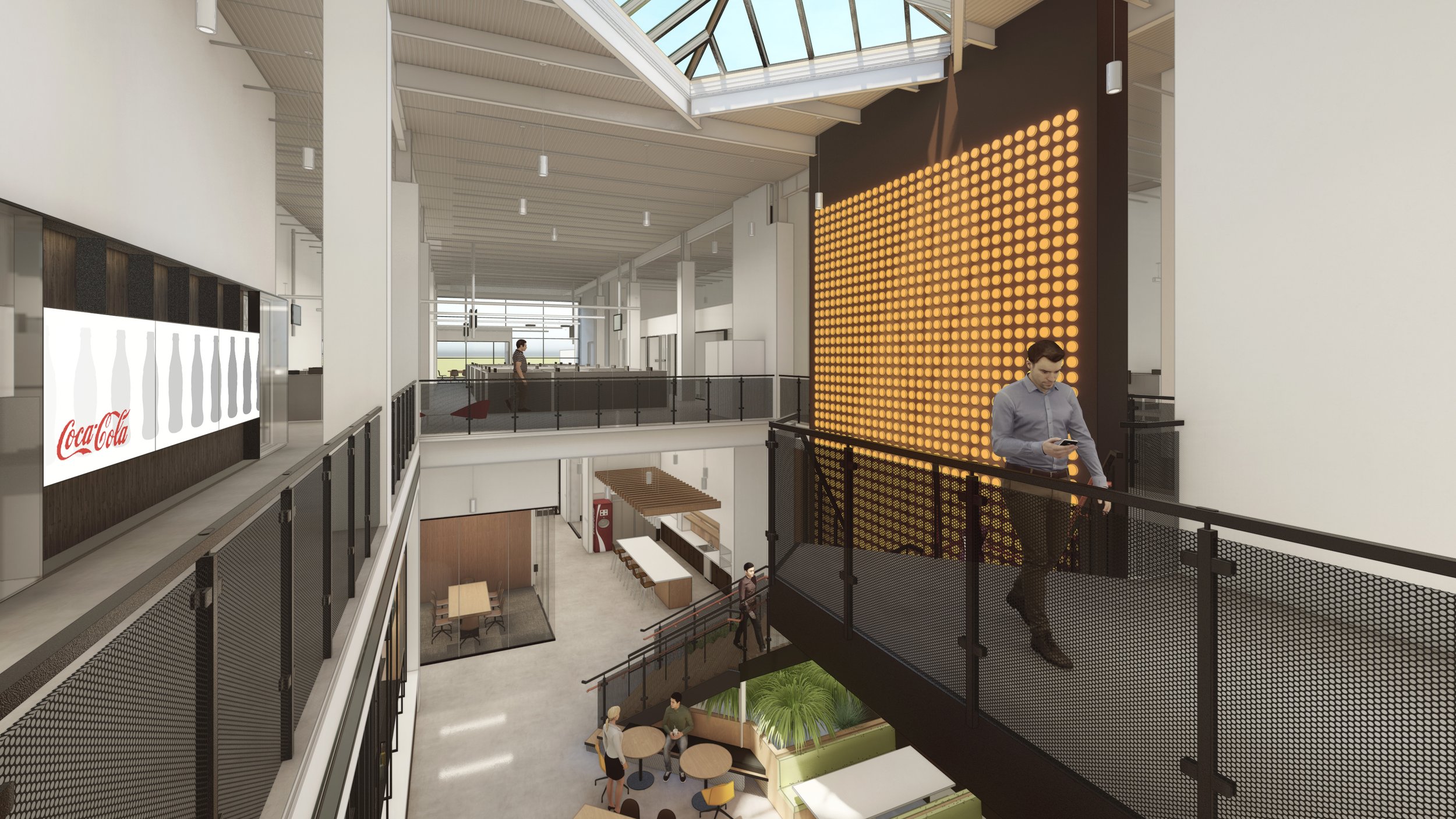
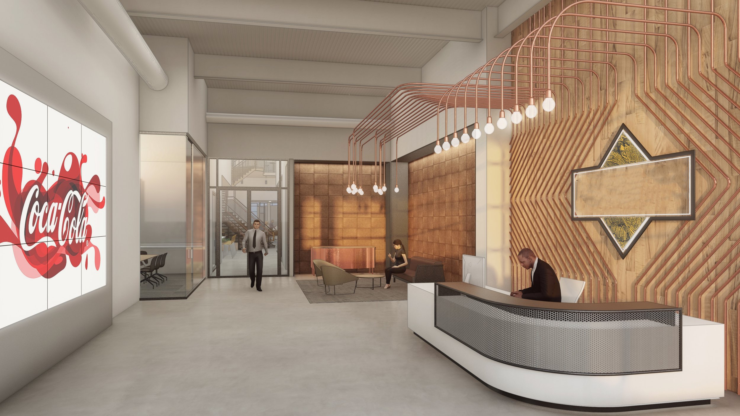
We are in the final stages of wrapping up an exciting project on Elston. Our client bought a two-story Art Van Furniture store and asked us to transform the space into a branded office for their beer division. Naturally, the project came with its challenges, but rather than minimize them, we let them guide our design decisions. At its center were two escalators lit by a pyramidal skylight, replaced by a monumental staircase and a large atrium space that now acts as a branded showcase of our client’s biggest accounts.
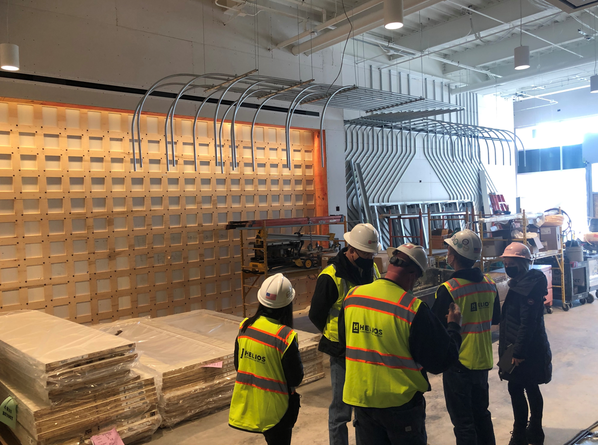
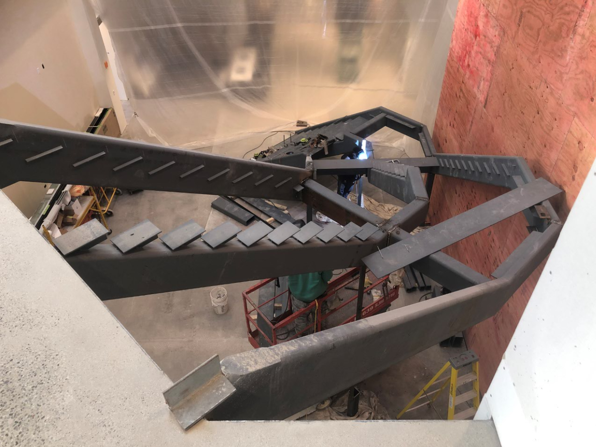
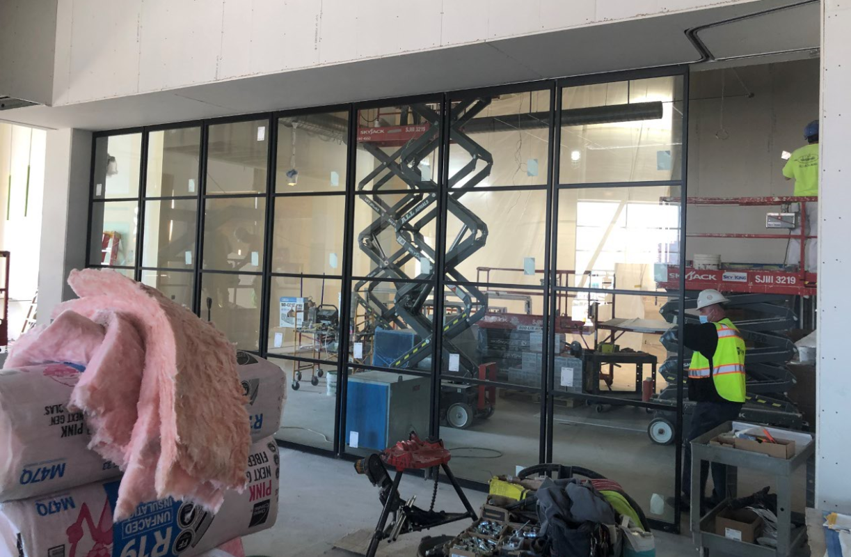
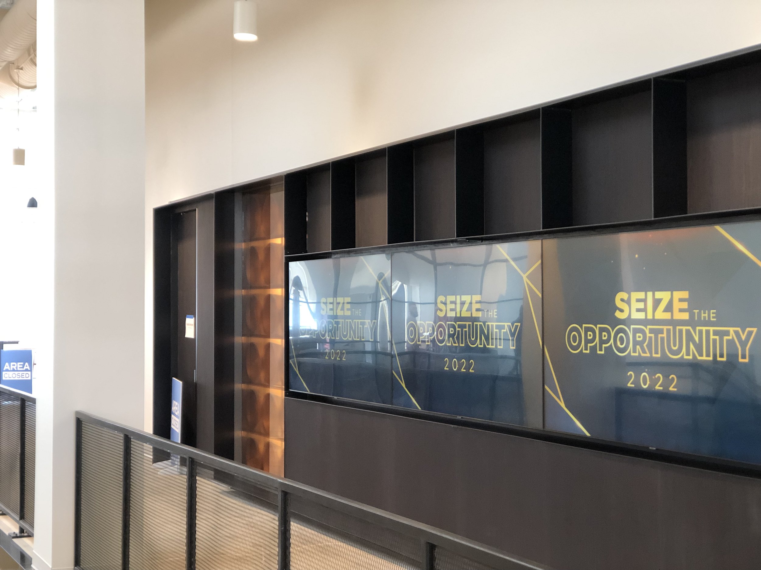
Taking advantage of the large floorplates that are common in large retailers, we created training spaces and amenity areas that capitalize on ample floor space. Our experience in both retail and corporate interiors came together to create a dynamic environment that works not only as an office but as a retail exhibition and gathering hub.
A large retail space isn’t the first place you might pick for your new office. But thanks to some creative thinking and a client with vision, we turned the building into the best possible version of itself.
