It’s no secret that the world is changing.
Construction costs are rising, the number of empty sites in urban centers is diminishing, and the world is demanding more of its built environment. It’s no longer enough for a store to exist near a customer base, it has to provide an experience. Multifamily developments can’t get by on location alone – they are expected to provide compelling and sophisticated amenities. Even healthcare is seeing significant disruption in how it’s delivered to communities.
With this rapid change comes a need to think creatively and strategically about our clients’ assets. The landscape of ownership and development is full of opportunities to take something that’s already there and do something interesting with it. From a strategic business imperative comes a need to shift our design perspective. As a pioneer in mixed-use environments, OKW has been thinking like this for decades. Our ability to reimagine, reinvent, or reposition existing spaces is what has made us a long-term partner in both design and business strategy.
Katie Lambert, design rockstar and OKW partner
Katie Lambert, AIA is instrumental in that partnership. In her role as OKW’s Design Director, she uses her eye for holistic and thoughtful design in nearly everything that we create. As a panelist in the upcoming Bisnow Chicago Adaptive Reuse and Repositioning, she will speak about the importance of creative thinking in addressing the constraints that architects face when transforming existing spaces.
We have divided this creative, architectural approach into three categories: reimagine, reinvent, and reposition.
THE HIP.
The most direct approach to taking something and making it better is to reposition it. In this case, we are talking about keeping both the building and its original use, but elevating the experience so it achieves greater relevance, higher value, and in doing so, attracts more of its intended audience.
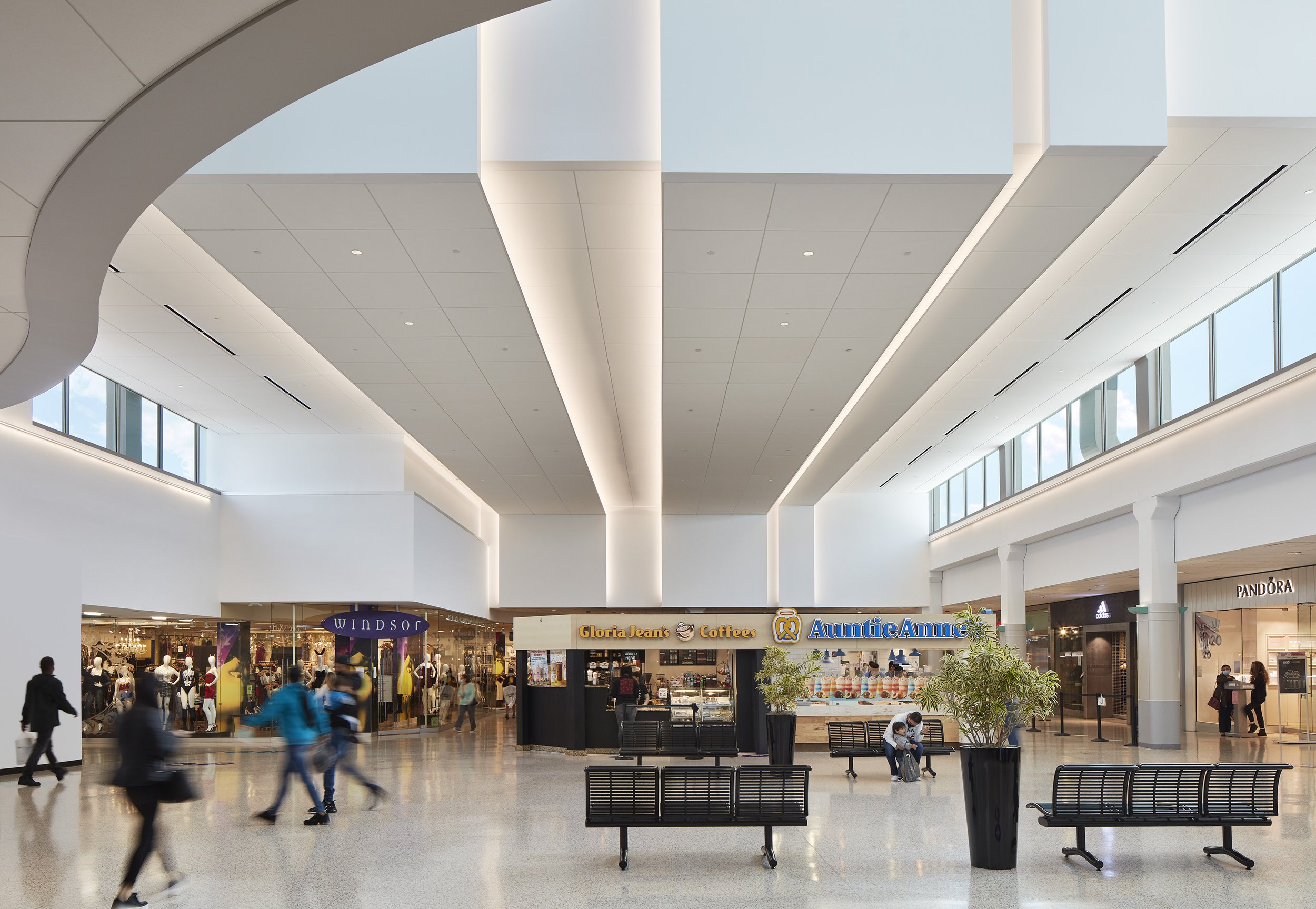
There’s no better example of this than Harlem Irving Plaza, or as its neighbors affectionately call it, “the HIP.” While it may sound like surgery, repositioning the HIP was an exercise in improving an asset known for staying with the times.
Photograph (right) by Steve Hall
The urban mall has been around since the 1950s, consistently reinventing itself with new additions and changes to meet changing preferences and demographics. Its most recent reinvention came when Carson Pirie Scott filed for bankruptcy, leaving the shopping center with a 150,000 SF empty space.
In architecture, Katie notes, constraints are good. You want to lean into them because that’s how you’ll reach the optimal solution to a problem. In HIP’s case, the constraints were significant. In today’s retail landscape, it is pretty challenging to find one tenant to lease 150,000 SF. The store shared plenty of wall space with a two-story parking deck, which would have made demolition its own enormous headache.
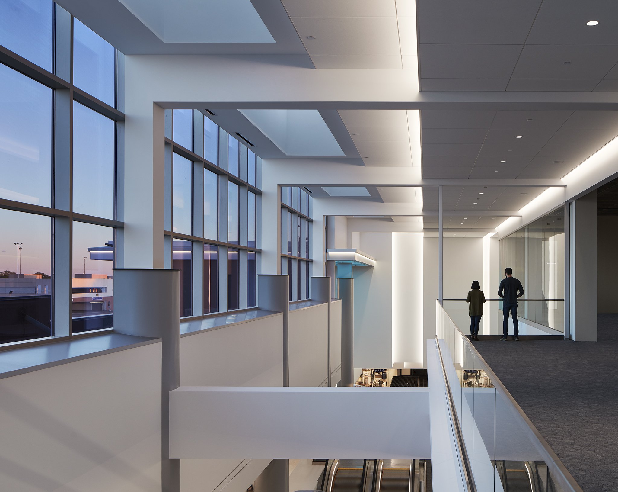
Photography by Steve Hall
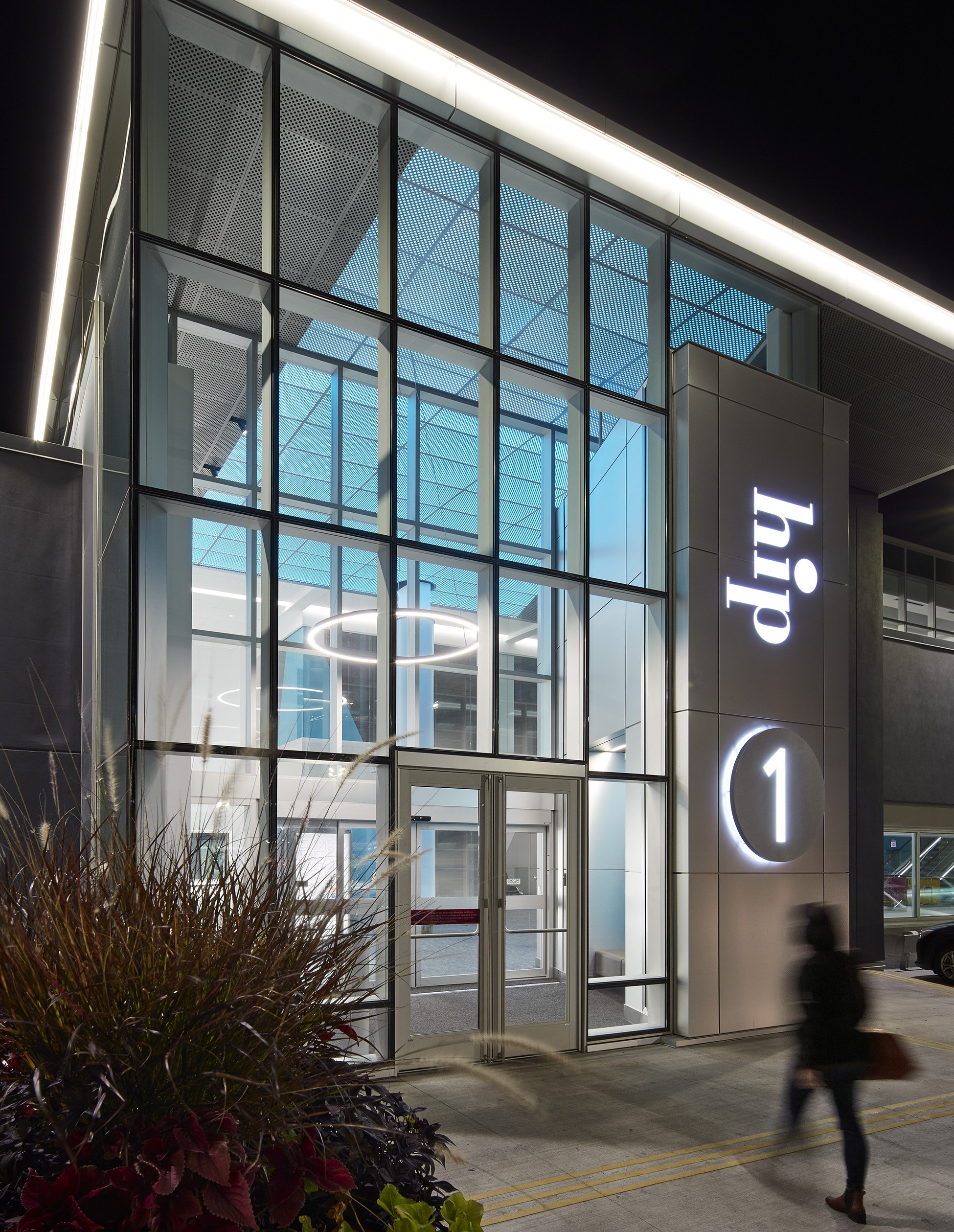
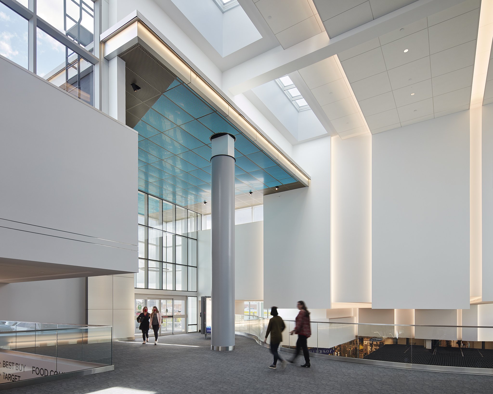
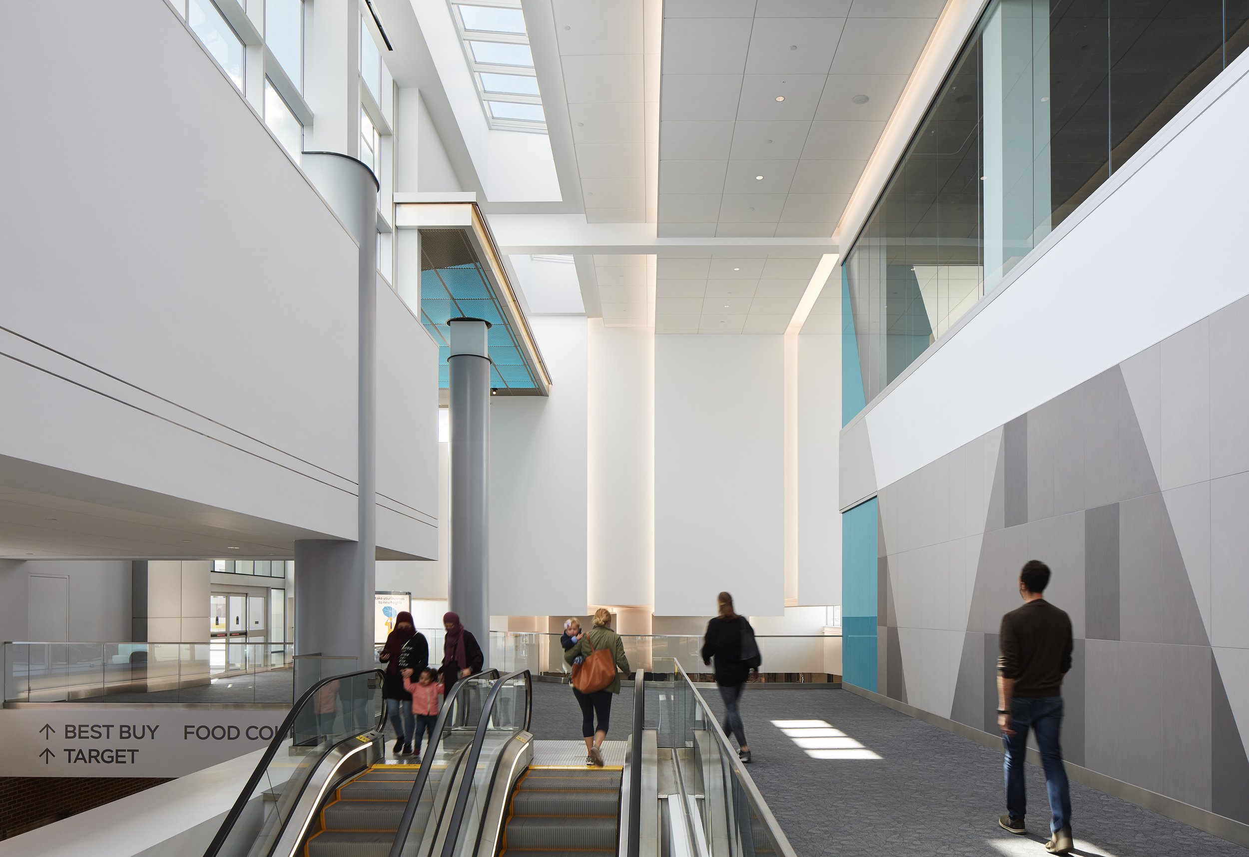
But the client couldn’t just leave the space empty. So we got to work repositioning the empty Carson’s to better fit the way that malls and the greater retail industry exist today. That began by subdividing the massive, three-story space into smaller retail spaces. We then carved out a vertical slice out of the corner to create a dramatic and light-filled entry into the mall from the rooftop parking deck.
The result is an intuitive and well-lit entry that instills pride of place for those who visit it. It’s still a retail space and it still lives in the same shell of its original buildout, but with a much better use and a better, more thoughtful design.

